

 Español
 Français
 Deutsch
 Italiano
 Polski
 Português
 Українська
 繁體中文
繁體中文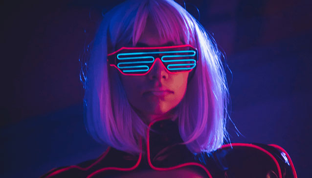
TOP 10 design trends in 2022
Today we’ll look at 10 design trends that we think can increase ad CTR for the rest of 2021 and into 2022
An important disclaimer right away. We don’t aim to be prescriptive in this article. This isn’t a list of dos and don’ts. Each creative aims for a specific audience and exists in a specific social and media context. Every design decision has a right to life – someone might like it. We’re only trying to illustrate a few general trends, styles, and motifs that seem relevant now. Some examples below are taken from real ads, some from social media brands, and some from Behance. so as not to infringe on anyone’s rights.
3D almighty
Hyper-realistic 3D is coming into widespread use. Graphics are looking more like photos or even capturing the natural textures of plants, clothes, cornflakes, or ice. But look more closely and you’ll see they’re graphics.
Bright, contrasting colours
Sharp colours have been on trend for a while because they highlight the originality and modernity of the product. They are also very good at setting the customer apart from competitors (especially if the latter use a more modest colour scheme). Especially trendy right now are combinations of pink, purple, lilac, and bright green. Of course, such hues work best with the under-25 age group; they might repel some older audiences.
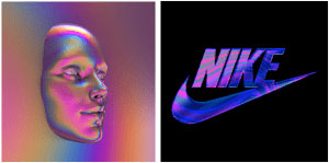
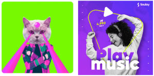
Holographic elements
Here we’re talking about bright colours, too, but with a twist. Holograms mix up all the colours of the rainbow in an oily sheen (think gasoline puddles or shiny decals from the ‘90s). This retro/industrial vibe appeals to hip urban audiences and young people. Holographic elements are often incorporated into streetwear and footwear brands, cosmetics, and music streaming services.
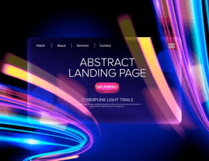
Neon and cyberpunk
Neon dots and dashes are a good way to spotlight a product. Cyberpunk has breathed new life into this early 20th-century technology, thanks to the release in late 2020 of a computer game called Neon. Of course, cyberpunk has long been an inspiration for designers, and it’s easy to find classic genre visuals like Knight City on the internet. Our forecasts suggest that the neon craze won’t last long, but it’s still with us.
Plastic, polyethylene film
Plastic has a rich history in mass culture: Back in the 1960s, Paco Rabanne presented a famous clothing collection with shiny plastic elements. The material enjoyed a new wave of popularity in the ’90s. It’s hard to say why plastic and polyethylene is back in vogue. Perhaps it’s related to another trend we support – sustainability. Recycled plastic certainly looks better on the ads than in our soil or water.
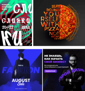
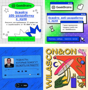
Typography and text
Here the text is deployed as a graphic element, not just as inscribed information. It can be figure as a backdrop to the main element of the composition or even become the focal point. One thing is clear: it’s not enough to pick a font and paste your text in the right place. It requires just as much work as the central image, if not more.
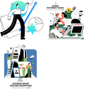
Simple and complex 2D illustrations
Simple vector drawings aren’t about to leave the designer’s workbench just yet. Schematic humans still sketch designs, peer into their laptops and drink coffee in visuals from even the big brands. But complex 2D illustration is evolving flat characters made from simple geometric shapes are being replaced by more complex figures with interesting facial expressions, shadow effects and variegated colouring.
The ‘90s experience
It’s hard to come up with the correct name for this graphic style. Sometimes it’s called the ‘90s Experience because its aesthetic is like the first versions of Microsoft Windows, with their crisp rectangles and simple, flat geometry. That sounds about right. The modern take on ‘90s style contains bright gradients and unusual shades. Often an aging texture is superimposed over the visual, making it look like a page from an old comic book or a worn-out magazine.

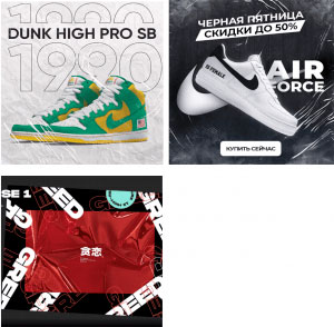
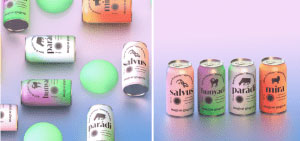
Close-ups and detail
Lately, product images on visuals are so large and clear that even the surface texture of the packaging and the smallest details can be seen. This technique literally brings the product “closer” to the potential buyer, allowing him to inspect it minutely for quality. Often this method is combined with a 3D effect. Parts of the product seem to float in the air, giving the picture depth and dimension.
Soft gradients
In principle, of course, any gradient is soft. But here we have in mind special gradient transitions with a glass effect, blurring, white undertones or backing, pastel shades or increasing opacity. From the examples below, this becomes clear. Soft gradients work well in the background, giving the image a contemporary feel without distracting from the main compositional object.
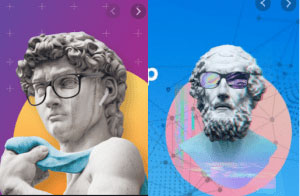
Ancient images
The faces or figures of classical statuary can lend an air of creativity or distinction.
Glassmorphism
We thought it was trending in 2019. Now it’s irrelevant. The thing is, though, glassmorphism is beautiful. And it’s still being used. Today, it’s quite normal to combine blurry “glass” elements with bright gradient backgrounds.
No matter how convinced the designer, manager, and business owner are that a creative idea is cool, it still needs to be tested. Sometimes a banner can be a masterpiece of technique, but it still doesn’t work. Every artistic device needs to be used wisely and intelligently combined with other solutions. It’s easy to go overboard. Typography that’s lovely but illegible is not going to do anyone any good.
Many of today’s trends are bizarre combinations. And that’s a trend, too! Glassmorphism throws together gradients and 3D, vector graphics are an integral part of the ‘90s Experience, and neon is impossible without bright and contrasting colours. Design is a unified system in which all the components are interconnected.
No matter how beautiful your visual, if the text is sloppy and hackneyed, the client will yawn and move on. So don’t get hung up on design and come to us for copywriting.